
All web developers know, at some level, that accessibility is important. But when push comes to shove, it can be hard to prioritize it above a bazillion other concerns when you’re trying to center a <div> and you’re on a tight deadline.
A lot of accessibility advocates lead with the moral argument: for example, that disabled people should have just as much access to the internet as any other person, and that it’s a blight on our whole industry that we continually fail to make it happen.
I personally find these arguments persuasive. But experience has also taught me that “eat your vegetables” is one of the least effective arguments in the world. Scolding people might get them to agree with you in public, or even in principle, but it’s unlikely to change their behavior once no one’s watching.
So in this post, I would like to list some of my personal, completely selfish reasons for building accessible UIs. No finger-wagging here: just good old hardheaded self-interest!
Debuggability
When I’m trying to debug a web app, it’s hard to orient myself in the DevTools if the entire UI is “div soup”:
<div class="css-1x2y3z4">
  <div class="css-c6d7e8f">
    <div class="css-a5b6c7d">
      <div class="css-e8f9g0h"></div>
      <div class="css-i1j2k3l">Library</div>
      <div class="css-i1j2k3l">Version</div>
      <div class="css-i1j2k3l">Size</div>
    </div>
  </div>
  <div class="css-c6d7e8f">
    <div class="css-m4n5o6p">
      <div class="css-q7r8s9t">UI</div>
      <div class="css-u0v1w2x">React</div>
      <div class="css-u0v1w2x">19.1.0</div>
      <div class="css-u0v1w2x">167kB</div>
    </div>
    <div class="css-m4n5o6p">
      <div class="css-q7r8s9t">Style</div>
      <div class="css-u0v1w2x">Tailwind</div>
      <div class="css-u0v1w2x">4.0.0</div>
      <div class="css-u0v1w2x">358kB</div>
    </div>
    <div class="css-m4n5o6p">
      <div class="css-q7r8s9t">Build</div>
      <div class="css-u0v1w2x">Vite</div>
      <div class="css-u0v1w2x">6.3.5</div>
      <div class="css-u0v1w2x">2.65MB</div>
    </div>
  </div>
</div>
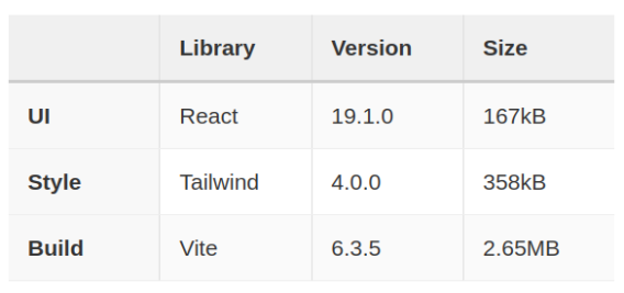
This is actually a table, but you wouldn’t know it from looking at the HTML:
If I’m trying to debug this in the DevTools, I’m completely lost. Where are the rows? Where are the columns?
<table class="css-1x2y3z4">
  <thead class="css-a5b6c7d">
    <tr class="css-y3z4a5b">
      <th scope="col" class="css-e8f9g0h"></th>
      <th scope="col" class="css-i1j2k3l">Library</th>
      <th scope="col" class="css-i1j2k3l">Version</th>
      <th scope="col" class="css-i1j2k3l">Size</th>
    </tr>
  </thead>
  <tbody class="css-a5b6c7d">
    <tr class="css-y3z4a5b">
      <th scope="row" class="css-q7r8s9t">UI</th>
      <td class="css-u0v1w2x">React</td>
      <td class="css-u0v1w2x">19.1.0</td>
      <td class="css-u0v1w2x">167kB</td>
    </tr>
    <tr class="css-y3z4a5b">
      <th scope="row" class="css-q7r8s9t">Style</th>
      <td class="css-u0v1w2x">Tailwind</td>
      <td class="css-u0v1w2x">4.0.0</td>
      <td class="css-u0v1w2x">358kB</td>
    </tr>
    <tr class="css-y3z4a5b">
      <th scope="row" class="css-q7r8s9t">Build</th>
      <td class="css-u0v1w2x">Vite</td>
      <td class="css-u0v1w2x">6.3.5</td>
      <td class="css-u0v1w2x">2.65MB</td>
    </tr>
  </tbody>
</table>
Ah, that’s much better! Now I can easily zero in on a table cell, or a column header, because they’re all named. I’m not wading through a sea of <div>s anymore.
Even just adding ARIA roles to the <div>s would be an improvement here:
<div class="css-1x2y3z4" role="table">
  <div class="css-a5b6c7d" role="rowgroup">
    <div class="css-m4n5o6p" role="row">
      <div class="css-e8f9g0h" role="columnheader"></div>
      <div class="css-i1j2k3l" role="columnheader">Library</div>
      <div class="css-i1j2k3l" role="columnheader">Version</div>
      <div class="css-i1j2k3l" role="columnheader">Size</div>
    </div>
  </div>
  <div class="css-c6d7e8f" role="rowgroup">
    <div class="css-m4n5o6p" role="row">
      <div class="css-q7r8s9t" role="rowheader">UI</div>
      <div class="css-u0v1w2x" role="cell">React</div>
      <div class="css-u0v1w2x" role="cell">19.1.0</div>
      <div class="css-u0v1w2x" role="cell">167kB</div>
    </div>
    <div class="css-m4n5o6p" role="row">
      <div class="css-q7r8s9t" role="rowheader">Style</div>
      <div class="css-u0v1w2x" role="cell">Tailwind</div>
      <div class="css-u0v1w2x" role="cell">4.0.0</div>
      <div class="css-u0v1w2x" role="cell">358kB</div>
    </div>
    <div class="css-m4n5o6p" role="row">
      <div class="css-q7r8s9t" role="rowheader">Build</div>
      <div class="css-u0v1w2x" role="cell">Vite</div>
      <div class="css-u0v1w2x" role="cell">6.3.5</div>
      <div class="css-u0v1w2x" role="cell">2.65MB</div>
    </div>
  </div>
</div>
Especially if you’re using a CSS-in-JS framework (which I’ve simulated with robo-classes above), the HTML can get quite messy. Building accessibly makes it a lot easier to understand at a distance what each element is supposed to do.
Naming things
As all programmers know, naming things is hard. UIs are no exception: is this an “autocomplete”? Or a “dropdown”? Or a “picker”?
If you read the WAI ARIA guidelines, though, then it’s clear what it is: a “combobox”!
No need to grope for the right name: if you add the proper roles, then everything is already named for you:
As a bonus, you can use aria-* attributes or roles as a CSS selector. I often see awkward code like this:
<div
  className=isActive ? 'active' : ''
  aria-selected=isActive
  role='option'
</div>
The active class is clearly redundant here. If you want to style based on the .active selector, you could just as easily style with [aria-selected="true"] instead.
Also, why call it isActive when the ARIA attribute is aria-selected? Just call it “selected” everywhere:
<div
  aria-selected=isSelected
  role='option'
</div>
Much cleaner!
I also find that thinking in terms of roles and ARIA attributes sharpens my thinking, and gives structure to the interface I’m trying to create. Suddenly, I have a language for what I’m building, which can lead to more “obvious” variable names, CSS custom properties, grid area names, etc.
Testability
I’ve written about this before, but building accessibly also helps with writing tests. Rather than trying to select an element based on arbitrary classes or attributes, you can write more elegant code like this (e.g. with Playwright):
await page.getByLabel('Name').fill('Nolan')

await page.getByRole('button',  name: 'OK' ).click()
Imagine, though, if your entire UI is full of <div>s and robo-classes. How would you find the right inputs and buttons? You could select based on the robo-classes, or by searching for text inside or nearby the elements, but this makes your tests brittle.
As Kent C. Dodds has argued, writing UI tests based on semantics makes your tests more resilient to change. That’s because a UI’s semantic structure (i.e. the accessibility tree) tends to change less frequently than its classes, attributes, or even the composition of its HTML elements. (How many times have you added a wrapper <div> only to break your UI tests?)
Power users
When I’m on a desktop, I tend to be a keyboard power user. I like pressing Esc to close dialogs, Enter to submit a form, or even / in Firefox to quickly jump to links on the page. I do use a mouse, but I just prefer the keyboard since it’s faster.
So I find it jarring when a website breaks keyboard accessibility – Esc doesn’t dismiss a dialog, Enter doesn’t submit a form, ↑/↓ don’t change radio buttons. It disrupts my flow when I unexpectedly have to reach for my mouse. (Plus it’s a Van Halen brown M&M that signals to me that the website probably messed something else up, too!)
If you’re building a productivity tool with its own set of keyboard shortcuts (think Slack or GMail), then it’s even more important to get this right. You can’t add a lot of sophisticated keyboard controls if the basic Tab and focus logic doesn’t work correctly.
A lot of programmers are themselves power users, so I find this argument pretty persuasive. Build a UI that you yourself would like to use!
Conclusion
The reason that I, personally, care about accessibility is probably different from most people’s. I have a family member who is blind, and I’ve known many blind or low-vision people in my career. I’ve heard firsthand how frustrating it can be to use interfaces that aren’t built accessibly.
Honestly, if I were disabled, I would probably think to myself, “computer programmers must not care about me.” And judging from the miserable WebAIM results, I’d clearly be right:
Across the one million home pages, 50,960,288 distinct accessibility errors were detected—an average of 51 errors per page.
As a web developer who has dabbled in accessibility, though, I find this situation tragic. It’s not really that hard to build accessible interfaces. And I’m not talking about “ideal” or “optimized” – the bar is pretty low, so I’m just talking about something that works at all for people with a disability.
Maybe in the future, accessible interfaces won’t require so much manual intervention from developers. Maybe AI tooling (on either the production or consumption side) will make UIs that are usable out-of-the-box for people with disabilities. I’m actually sympathetic to the Jakob Nielsen argument that “accessibility has failed” – it’s hard to look at the WebAIM results and come to any other conclusion. Maybe the “eat your vegetables” era of accessibility has failed, and it’s time to try new tactics.
That’s why I wrote this post, though. You can build accessibly without having a bleeding heart. And for the time being, unless generative AI swoops in like a deus ex machina to save us, it’s our responsibility as interface designers to do so.
At the same time we’re helping others, though, we can also help ourselves. Like a good hot sauce on your Brussels sprouts, eating your vegetables doesn’t always have to be a chore.